
You currently record defects in manufacturing with an Excel template or a paper form, and you are asking whether that still works across several shifts, lines or sites. As soon as people transfer data twice, log it late or merge it by hand, the analysis loses reliability and responses slow down. This article shows you when Excel is enough, where it breaks down and what a digital solution has to deliver.
Key takeaways
Defects and defective units are two different metrics. Record them separately or your rates will not hold up.
Paper and Excel reach their limits across multiple shifts, lines or sites, especially once people transfer data twice or log it after the fact.
A digital check sheet earns its value through guided input, automatic order data and central availability, not through digitalization alone.
The choice between Excel and an integrated solution depends on user numbers, response speed and integration needs, not on the wish to digitalize.
A successful rollout starts with one clearly bounded pilot process and a cleaned-up, consistent defect catalog.
What is a digital defect check sheet?
A digital defect check sheet is a quality tool for the structured recording and analysis of attribute inspection results. It counts defined defect types and links them to an inspection object and the relevant process data, rather than only evaluating continuous measurements such as length, weight or torque.
In an attribute inspection, the quality inspector classifies a characteristic, for example as good or defective, or counts visible defects. A typical defect check sheet therefore contains rows for defect types such as scratches, burrs, missing components or incorrect labeling. Every defect found increases the corresponding count.
The distinction between defects and defective units matters. One component can carry several defects. Ten recorded defects therefore do not automatically mean ten defective parts. For reliable defect rates, the sheet needs a reference value alongside the defect count, such as the inspected quantity or the number of comparable defect opportunities.
A classic, static defect check sheet mainly captures defect types and frequencies. A digital version adds order data, time stamps, photos, comments and, where useful, measured values. Those measurements provide context for the finding, while the defect count stays attribute based. Methodically the check sheet belongs to the seven basic quality tools and supplies the data foundation for Pareto analysis, control charts and root cause work.
When is an Excel defect check sheet still enough?
An Excel defect check sheet is quick to build, cheap to adapt and usable without extensive training. Its limits appear as soon as several shifts, lines or sites need the same data promptly, consistently and traceably.
For a limited trial, a rare inspection or a single workstation, Excel is often the right call. Tables, drop-down lists and simple charts are enough to count defect types and produce a first Pareto analysis. In administrative processes or services, the template also works as an uncomplicated entry point.
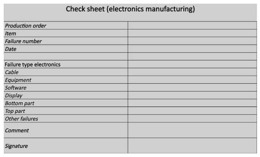
Excel defect check sheet template for electronics manufacturing with fields for production order, quantity, number of defects, date, defect types such as wiring, assembly, software, display and housing, plus comment and signature.
The problem is not Excel as a calculation tool, it is the isolated process design around it. Quality departments often build a file, print it and have it filled in by hand on the shopfloor. Even with direct entry, you keep version conflicts, local copies, missing mandatory fields and manual consolidation. The following four effects show where the method fails day to day.
Limits of paper-based recording on the shopfloor
Paper separates recording from the actual flow of information. In takted work, with gloves, in dirty environments or at changing inspection stations, acceptance drops as soon as the form is not immediately and unambiguously usable.
People have to find the right sheet, enter order and product by hand and look up defect codes. Illegible handwriting, inconsistent wording or lost forms undermine the analysis. Extra walking distances make it worse when the sheet is not right at the inspection station.
The most common misjudgment here: short training time gets mistaken for high process reliability. Almost anyone understands a tally sheet immediately. Reliable data still only emerges from clear defect definitions, accessible recording tools and defined ownership per process step.
What late entries do to data quality
Late entries create data gaps, memory errors and incorrect time references. The analysis then loses its link to order, machine, material batch, shift or process state.
Anyone logging several findings at the end of a shift easily confuses similar defect patterns or lumps individual events together. Quality managers then see neither the exact moment of occurrence nor clusters after setup processes, tool changes or specific material batches.
The consequences go beyond imprecise statistics. Based on incomplete data, a Pareto chart may prioritize the wrong focus. A control chart signals too late. Shift leads and maintenance react to symptoms while the process keeps producing scrap or rework.
The hidden cost of manual transfer
Manual transfer creates duplicate work, because people record the same information first on paper or in Excel and later again in ERP, CAQ or BI systems. Checking and cleaning that data ties up qualified working time on top.
Before any real analysis, people decipher handwriting, harmonize defect names, remove duplicates and add reference values. Copying errors and diverging file versions trigger further correction loops. This work is necessary, but it adds no quality value.
Timeliness is the decisive factor. A perfectly cleaned weekly statistic arrives too late for a batch that is running defective right now. The wider the gap between finding and digital availability, the longer immediate containment and root cause analysis are delayed.
Blind spots and gaps in traceability
Blind spots appear when current inspection results only exist on local forms that other roles cannot see. Traceability gaps appear when findings are not clearly linked to order, batch, product, inspector, time and corrective action.
While the paper record is in transit or sitting in a folder, quality management has no complete picture. Cross-site comparisons are only possible after consolidation. In a customer complaint or an audit against ISO 9001 or IATF 16949, reconstructing the trail costs unnecessary time.
None of this makes paper inadmissible or useless. A properly controlled form with a unique version, defined filing and complete sign-off does its job. For fast responses, flexible analyses and an unbroken data chain, it is structurally at a disadvantage.
What a digital defect check sheet does better
A digital defect check sheet records findings in structured form at the point of origin and makes them available for analysis and follow-up without re-entry. It removes media breaks, provided master data, roles, interfaces and escalations are configured properly.
Do not expect the effect from digitalization itself. An unclear defect catalog stays unclear on a tablet. The value comes from combining guided input, automatic context, central data storage and prompt response.
Dynamic recording has proven itself in practice: the system only shows the defect types, cause options and inspection steps that fit the selected product, operation and order. Mandatory fields and plausibility rules prevent incomplete records without burdening the operator with unnecessary input.
Linking defect types to causes
A digital check sheet assigns standardized causes, process parameters and actions to every defect type. That makes recurring patterns easier to compare, as long as the team keeps suspected causes clearly separate from confirmed root causes.
An example: for the defect type "scratch on visible surface", the inspector first selects the area of origin and an observed accompanying condition, such as transport container, handling or clamping device. That selection is not yet proof of cause. Confirmation comes from gemba observation, Ishikawa, 5 Why, trials or other suitable analyses.
A three-level data model prevents premature conclusions:
Defect pattern: What was found?
Cause hypothesis: Which cause is suspected first?
Confirmed root cause: Which cause was proven by analysis or trial?
This separation strengthens later comparisons and supports 8D reports as well as updates to process FMEA and control plan.
Photos, measurements and comments at the point of work
Tablet, smartphone or a stationary terminal guide the inspector through recording and store photos, comments and measured values directly with the finding. All information stays connected to the same order and defect record.
A photo documents the position, severity and surroundings of the defect. Where the solution supports image markup, it directs attention to the relevant spot. Measured values such as gap dimension, torque or surface roughness complement the attribute finding, while a short comment captures special circumstances.
What counts on the shopfloor: few large input areas, plain wording and a small number of mandatory steps. Offline capability is required wherever wireless coverage is patchy. Once the connection returns, the system has to synchronize in a controlled way and make conflicts visible.
Transparency across defect rates, shifts and sites
Centrally stored findings can update dashboards immediately after recording. Quality management, shift leads and plant management then see defect frequencies and normalized rates by product, line, shift, order or site.
Absolute defect counts alone lead to poor decisions. A shift with higher output often shows more defects even though its defect rate is lower. The dashboard therefore has to account for inspected quantities, scrap, rework and defect opportunities.
Useful metrics include the share of defective units, defects per 100 inspected units, first pass yield, and scrap and rework rates. For statistical process monitoring, p, np, c or u charts fit depending on the data. Limits and alerts need sound rules so that normal variation does not turn into constant alarm noise.
How does a digital defect check sheet speed up continuous improvement?
The digital defect check sheet shortens the path from finding to prioritized action. It accelerates continuous improvement when owners monitor defined thresholds, assign deviations and verify effectiveness using the same metrics.
A critical defect triggers a block, escalation or re-inspection right away. Recurring less critical defects feed Pareto analyses and quality circles. After a countermeasure, the team compares the defect rate before and after the change under comparable conditions.
A closed loop is what matters. Dashboard transparency alone solves nothing. Only ownership, deadline, action, effectiveness check and standardization turn recorded data into a real improvement contribution.
Digital defect check sheet and Excel side by side
Excel suits manageable, local and infrequent recording. A digital defect check sheet is the better choice when many users, time-critical responses, traceability or integrations are required.
Recommendation: Use Excel for a time-boxed pilot or a stable single process with low data volume. Move to an integrated solution as soon as data gets transferred twice, responses become time critical or several functions have to assess the same quality situation. Let the process need trigger the decision, not the wish to digitalize.
Which functions should a digital defect check sheet offer?
A practical solution has to be fast to operate, mobile, traceable and integrable. It should simplify data capture while supplying enough context for root cause analysis, audits and action tracking.
Use the following list as a minimum scope when you compare vendors:
Guided operation: large controls, plain language, short paths and context-dependent fields
Order and product context: production order, material, variant, operation, line and batch carried over automatically
Controlled defect catalog: unambiguous defect codes, definitions, example images and maintained versions
Rich findings: photos, comments, attachments and relevant measured values
Plausibility checks: mandatory fields, value ranges, quantity checks and duplicate protection
Mobile and robust use: tablet, smartphone or terminal plus offline mode where coverage is patchy
Traceability: time stamps, user or role reference, change history and documented approvals
Escalations: notifications, block decisions and assignment of critical findings by defined rules
Analysis: dashboard, Pareto analysis, normalized metrics, filters and export
Interfaces: documented connection to ERP, CAQ and BI plus clearly defined data ownership
Permissions and data protection: role-based access, data minimization and appropriate retention
Administration: simple maintenance of master data, inspection plans, thresholds and translations
Industry-specific additional requirements
In automotive, the links to control plan, inspection plan and IATF 16949 processes count. In regulated environments, validation, electronic signatures and stricter audit trails come on top. Select these functions based on your actual compliance requirements, not as a blanket checklist.
Putting it into practice with Operations1
You can cover a large share of these requirements with Operations1 without rebuilding your existing Excel form one to one. In digital documents, teams record defect classifications, measured values and photo evidence using interactions such as multiple choice, numeric input, photo capture and table. Numeric inputs can carry limits and real-time error detection, so deviations surface immediately.
Every report stays linked to its order and to the document version used. Variables can be filled with order-specific values such as batch numbers at order start via the order connector or the public API. The digital inspection documentation software runs downloaded documents and orders offline as well and synchronizes the data automatically once the device reconnects.
From a report, teams create tasks with assignee, due date and status tracking. The Analytics module analyzes failed reports, compares reports across freely selected periods and visualizes defect points with image and video. Connectors and a documented public API are available for connecting ERP or MES systems. One clearly bounded pilot process shows you whether your own defect catalog maps cleanly and how the results compare with your current method.
| Criterion | Excel or printed template | Digital, integrated error documentation card | |---|---|---| | Implementation | Quick for simple local use cases | Requires process design, configuration, and piloting | | Operation | Familiar format, very low threshold for paper-based use | Guided, role- and order-specific input | | Data capture | Often manual and free-text | Structured selection, mandatory fields, and plausibility checks | | Timeliness | Dependent on filing, transfer, and consolidation | Central availability directly after capture or synchronization | | Photos and measured values | Separate files or manual assignment | Direct assignment to the finding | | Traceability | Only with consistent form control and filing | Timestamps, versions, and object reference in the data record | | Evaluation | Local formulas and manual consolidation | Current dashboards, filters, control charts, and cross-site analyses | | Integration | Import and export mostly manual | Interfaces to ERP, CAQ, and BI | | Scalability | Versioning and consolidation effort increases significantly | Central standards with site-specific configuration | | Operation | Low initial effort, hidden maintenance costs | Higher implementation effort, but fewer media breaks | | Dependencies | File access and local Excel knowledge | Devices, authorizations, system availability, and support concept |
How does the digital defect check sheet work in practice?
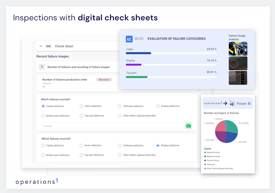
The digital flow runs from the production order through structured recording of findings to comparative analysis. Each step adds context, so a plain defect count turns into a usable basis for decisions.
Select the production order: The operator scans a barcode or picks the order on a tablet, laptop or smartphone. The application pulls product, variant, operation, target quantity, batch and line from the connected order data.
Record inspected quantity, defective units and defects: The quality inspector documents all three figures separately. The system checks the quantities for plausibility, so defect counts and scrap parts do not get mixed up.
Select defect type and cause hypothesis: The application shows the defect types defined for that product. For a milled housing, the inspector might select "burr at bore" and add "tool wear" as a first hypothesis. The cause only counts as confirmed after verification.
Document the finding: The inspector photographs the burr and adds a measured value and a comment. All information stays linked to order, component and time.
Analyze defect types and causes: After completion, the system aggregates the data by frequency, rate, severity and cost impact. The quality team prioritizes the focus with a Pareto chart and investigates the root cause, for example with Ishikawa and 5 Why.
Compare defect statistics: Owners compare products, machines, tools, shifts or sites on one consistent data basis. After the tool change, they check whether the normalized burr rate drops under comparable conditions.
Recommendation: Keep the recording path on the shopfloor as short as possible, but keep inspected quantity, defective parts and individual defects strictly separate. Those three figures are indispensable for later rates, control charts and credible proof of improvement.
Integration with ERP, CAQ and Power BI
An integrated defect check sheet pulls order and master data from the leading systems and passes structured quality data on to CAQ, ERP or Power BI. Clear system ownership prevents duplicate records and contradictory metrics.
ERP typically supplies production order, material number, variant, batch, operation and planned quantity. CAQ manages inspection plans, characteristics, defect catalogs, inspection decisions and quality notifications. A BI platform such as Power BI combines the data with production, cost or delivery figures for cross-site analysis.
For the technical connection, APIs, event interfaces, standardized file exports and database connections are available depending on the solution. An automatic export only makes sense once IDs, time zones, units, versions and status values map unambiguously. Otherwise the interface simply shifts the manual cleanup into the data pipeline.
Decide these points before implementation:
Which system owns order, inspection plan, defect code and corrective action?
Which data flows in which direction?
When does a record count as complete or approved?
How does the integration handle corrections, duplicates and connection losses?
Which metric definitions apply across all sites?
Who monitors interface errors and master data quality?
In practice, step-by-step integration beats a full build-out at once. Start with stable order master data and the export of findings. Add feedback, actions and automated escalations afterwards.
How do you introduce a digital defect check sheet in manufacturing?
Introduction succeeds with one clearly bounded pilot process, a consistent defect catalog and early involvement of the future users. Only roll the solution out to further lines or sites once data quality and response paths are proven.
Define goal and starting point: Name the concrete problem, for example late scrap reports or missing batch traceability. Record starting values for data completeness, recording time and response time.
Choose the pilot process: Pick a relevant but manageable process with a committed shift lead and clear quality characteristics. A highly complex problem process is the wrong first test.
Clean up the defect catalog: Harmonize defect codes, definitions, severity levels and example images. Separate defect pattern, hypothesis and confirmed cause.
Design the flow and responsibilities: Define who records, checks, escalates, blocks and follows up on actions. Align the process with quality management, manufacturing, maintenance, IT and, where analyses are personal data, with the responsible employee representative bodies.
Secure the technical basis: Check devices, wireless coverage, offline operation, user management, interfaces, IT security and support. Test the flow under real conditions with gloves, noise and takt time.
Train by role: Train not only the handling but above all consistent defect classification and the handling of escalations. Short exercises with real defect patterns beat presentations.
Measure the pilot and refine: Check data completeness, adoption rate, misclassifications and time to response. Remove unnecessary fields and clarify frequently confused defect types.
Roll out with a standard: Transfer the proven core and allow only justified local variants. Name owners for master data, metrics and system operation.
The most common rollout mistake is a digital copy of the paper form without any process improvement. Recommendation: Design the information flow from finding to action first, then digitalize exactly that target process. The solution stays lean and acceptance on the shopfloor stays high.
Comparing defect statistics and using them for benchmarking
Benchmarking only holds up when all compared areas use the same defect definitions, reference values and recording rules. Normalized rates and statistical context matter more than a ranking of absolute defect counts.
Comparisons by product, shift, machine or site show where deviations cluster and where proven process conditions exist. Account for product mix, lot size, inspection intensity, degree of automation and differing defect opportunities. A site with stricter inspection must not be rated worse simply because it finds more.
Meaningful benchmarking metrics include:
Share of defective units per inspected quantity
Defects per defined number of inspected units
Defects per defect opportunity for products of differing complexity
First pass yield, scrap rate and rework rate
Cost of defects and severity
Time from finding to containment and to confirmed cause elimination
Recurrence rate after a completed action
Start with an internal comparison over time before you put shifts or sites against each other. A time comparison shows whether an action improves your own process for good. Site rankings without context create the wrong incentives, such as under-reporting or inconsistent classification.
Does a digital defect check sheet reduce the defect rate for good?
A digital defect check sheet does not reduce the defect rate through recording alone. It contributes lastingly when complete data leads promptly to confirmed causes, effective actions and updated standards.
Its direct value lies in transparency, response speed and traceability. Lasting quality impact only emerges together with root cause analysis, 8D, poka yoke, FMEA, standardized work instructions and effectiveness checks in the PDCA cycle. For recurring process deviations, statistical process control complements plain defect counting.
Four conditions decide the outcome:
People record findings completely and immediately at the point of origin.
Defect catalogs and reference values are unambiguous and comparable across sites.
Owners respond to defined thresholds and track actions through to proof of effectiveness.
ERP, CAQ and BI use consistent master data and metric definitions.
Under these conditions, the digital defect check sheet grows from an isolated inspection form into an integrated quality tool. It makes quality problems visible earlier and shortens the control loop. So start by checking where in your process the most time is lost today between finding and action. The actual defect prevention comes from robust processes, solid root cause analysis and consistently standardized countermeasures.
FAQ
Which of the 7 quality tools does the defect check sheet belong to?
The defect check sheet is one of the seven basic quality tools associated with Kaoru Ishikawa. It creates the structured data foundation on which the other tools prioritize defects, examine relationships and analyze causes.
The 7 QC tools typically include the check sheet or inspection sheet, histogram, control chart, Pareto chart, cause-and-effect diagram, scatter diagram and, depending on the version, flow chart or stratification. Sources differ on the exact list and grouping. For practical work, this split helps:
Capture data and make process behavior visible: check sheet, histogram and control chart
Prioritize and analyze problems: Pareto chart, flow chart, scatter diagram and the Ishikawa cause-and-effect diagram
The split is not a hard boundary. A histogram already condenses data, while a control chart does not merely document process deviations but evaluates them statistically. What matters is the tool chain: capture reliable data first, then assess patterns, then confirm causes.
What is the difference between a defect check sheet, an inspection sheet and a tally sheet?
The inspection sheet is the umbrella term for a standardized recording form. The defect check sheet is a specific form of it, while the tally sheet is simply a counting method used within such a sheet.
An inspection sheet documents inspection steps, characteristics, target specifications, results and approvals. It can contain attribute findings as well as variable measurements. A defect check sheet, by contrast, focuses on the occurrence of defined defect types and their frequency.
The tally sheet represents each observation with a stroke, usually grouped in fives. In everyday use, tally sheet, defect list and defect check sheet are often treated as synonyms. Technically that falls short: a complete defect check sheet also carries context such as order, product, line, shift, inspected quantity and inspection time. Only that context makes comparisons and traceability reliable.
How is the defect check sheet used in the PDCA cycle and in quality circles?
In the PDCA cycle, the defect check sheet mainly supplies structured actual data in the Do and Check phases. Quality circles use that data to set priorities, implement actions and verify their effect in the next cycle.
In the Plan phase, the team defines the problem, the inspection object, the defect catalog and the target value. During Do, people record defects according to consistent rules. In Check, the team evaluates frequencies, rates and distributions. In Act, it standardizes effective countermeasures or starts a new analysis cycle if the effect falls short.
This combination has proven itself: the defect check sheet supplies the data, the Pareto chart prioritizes the most frequent or most expensive defects, the Ishikawa diagram structures possible causes and 5 Why deepens the investigation. For complex or customer-relevant deviations, 8D, an FMEA update and poka yoke follow. The defect check sheet does not replace these methods, it feeds them verifiable findings.